
Design Systems Overview
At Pinterest, I contributed to the evolution of Gestalt from a growing design system into a more scalable and widely adopted foundation for product teams. I was part of several initiatives, including a system-wide visual refresh, new and updated component designs, the redesign of the internal documentation site, and system alignment of the components in our self-service tool.
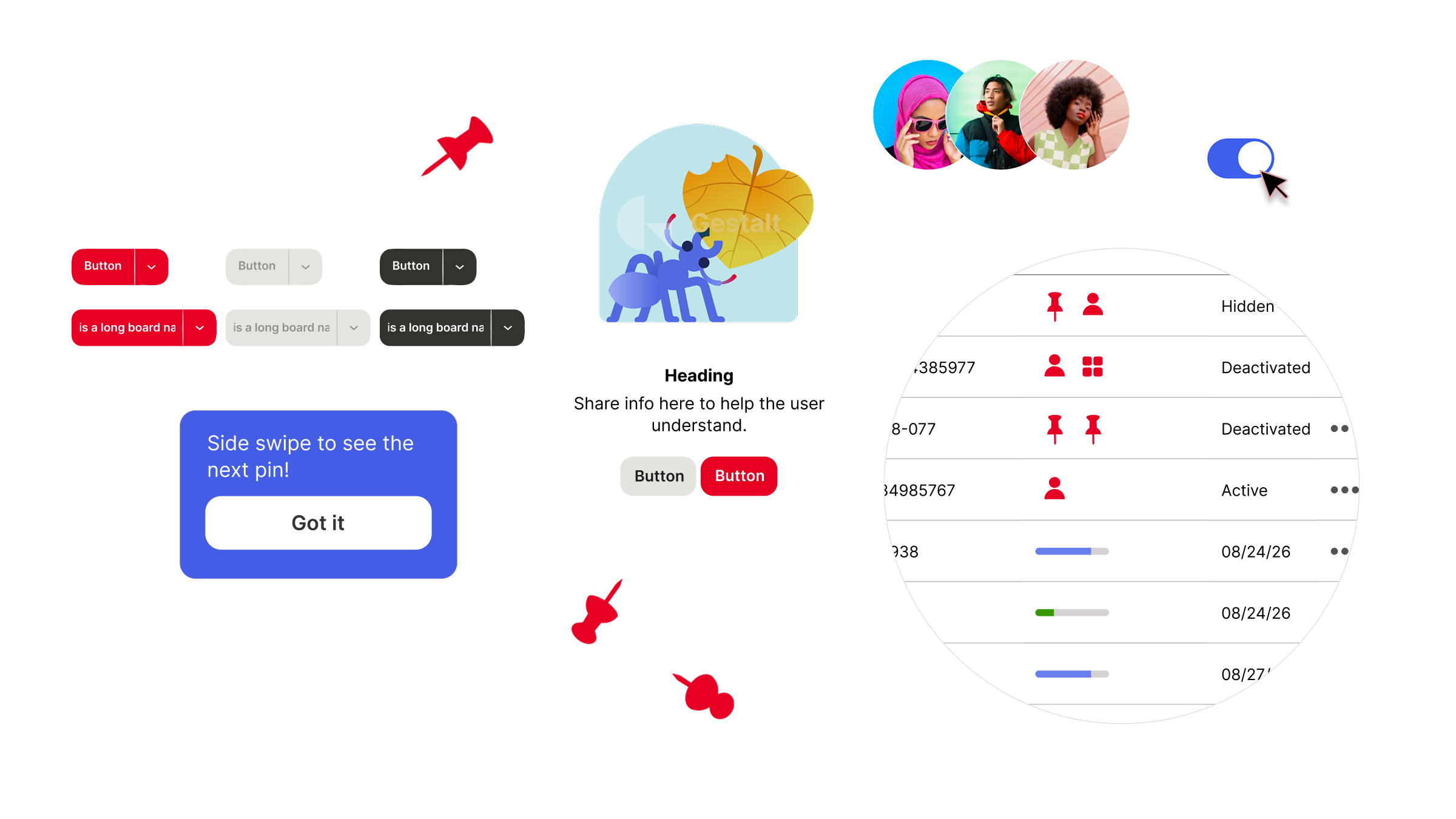
As Gestalt expanded, adoption across product teams was still uneven. Teams were creating custom solutions when the system didn't meet their needs, resulting in:
Custom components and patterns outside Gestalt
Visual and behavioral inconsistencies
Product teams blocked by lack of system flexibility
Extra engineering effort to maintain bespoke UI
The opportunity was to make a design system that was more comprehensive, flexible, and easier for teams to adopt.
The Challenge
I worked across the Gestalt ecosystem to make it more connected and easier for product teams to use. My work spanned the design foundations, components, design tokens, documentation, and standardizing the existing self-service components.
This included:
Modernizing the system through a refresh, updating foundational patterns and bringing Gestalt forward visually
Expanding the library with new components and enhancements designed to support needs across multiple product teams
Connecting design and code by working with a staff designer to learn and use Tokens Studio
Improving how designers discover and understand Gestalt components through the redesign of the internal documentation site
Auditing and redesigning components in Pinterest’s self-service tool
The Solution
The Visual Refresh
I joined the team during one of the final phases of the Visual Refresh, helping certify components against the updated design system. I reviewed everything from typography and color tokens to spacing and corner radius, ensuring each component reflected the new visual standards.
Component contributions
I led component contributions to Gestalt from initial request through implementation, partnering with designers, engineers, and stakeholders to create new components and enhance existing ones. I evaluated use cases, refined designs for broader adoption, documented specifications, and worked closely with engineers through implementation.
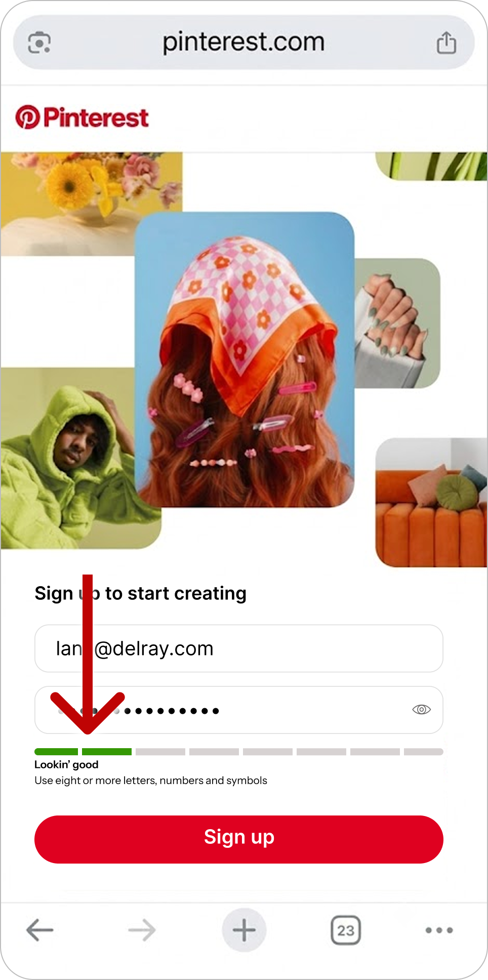
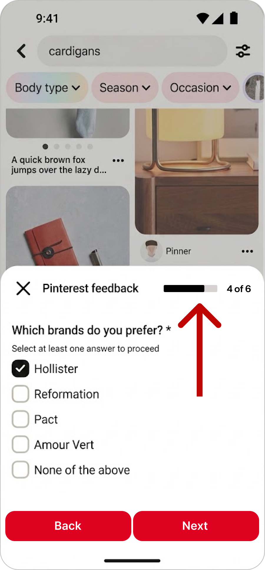
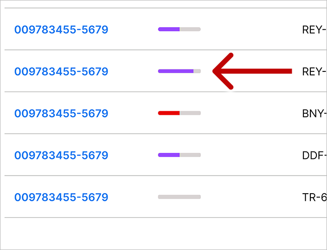
One example was our work to unify progress bars across Pinterest. A cross-product audit revealed 120 instances of custom progress bars across 7 teams, representing roughly 6 different patterns—highlighting a clear opportunity to create a more unified solution.
The challenge was designing a single progress bar that could support the needs of multiple teams without creating a collection of one-off variations. We explored the use cases in parallel, identifying common structures and behaviors while preserving differences that were meaningful to each experience.
Progress Bar
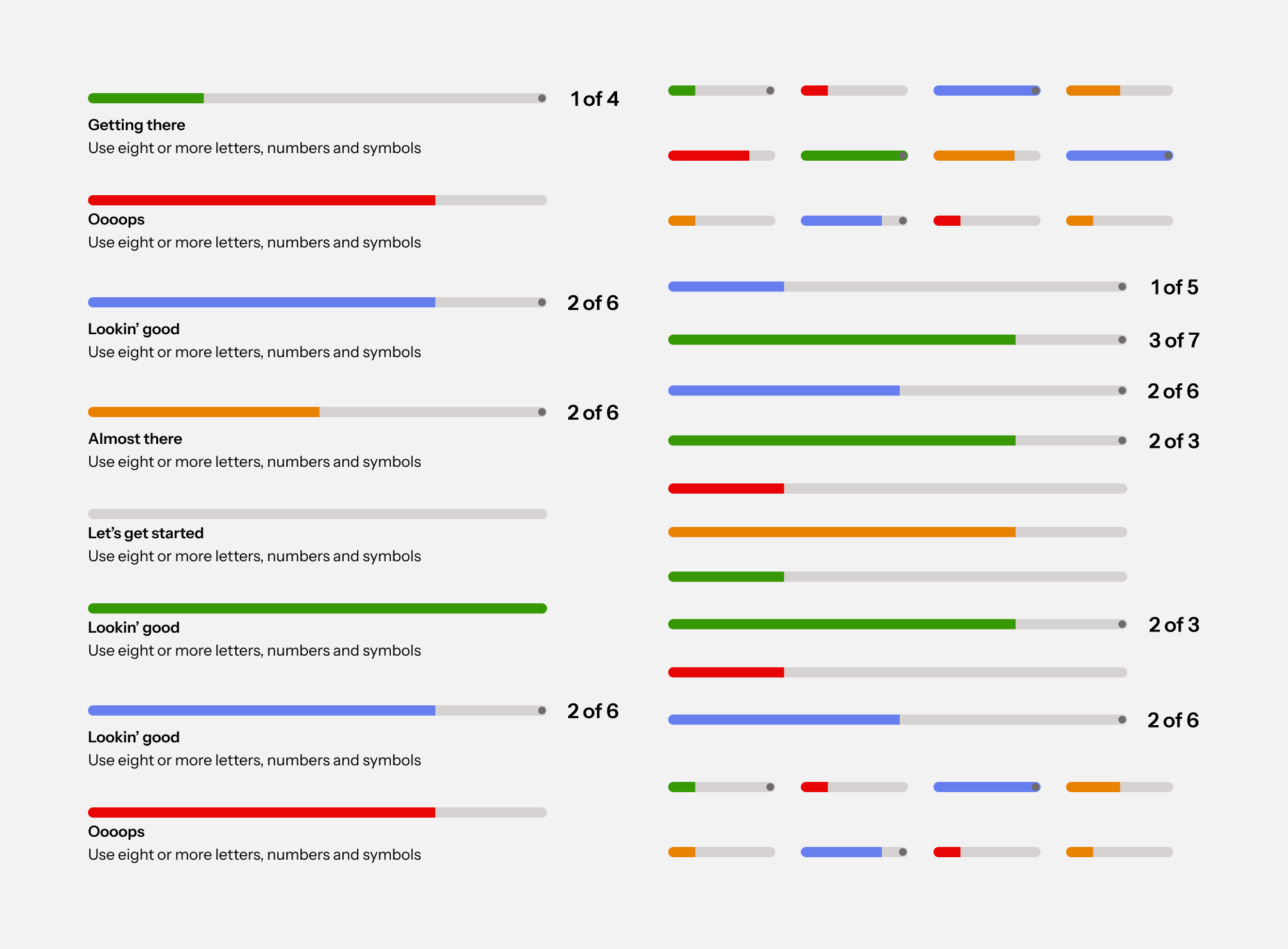
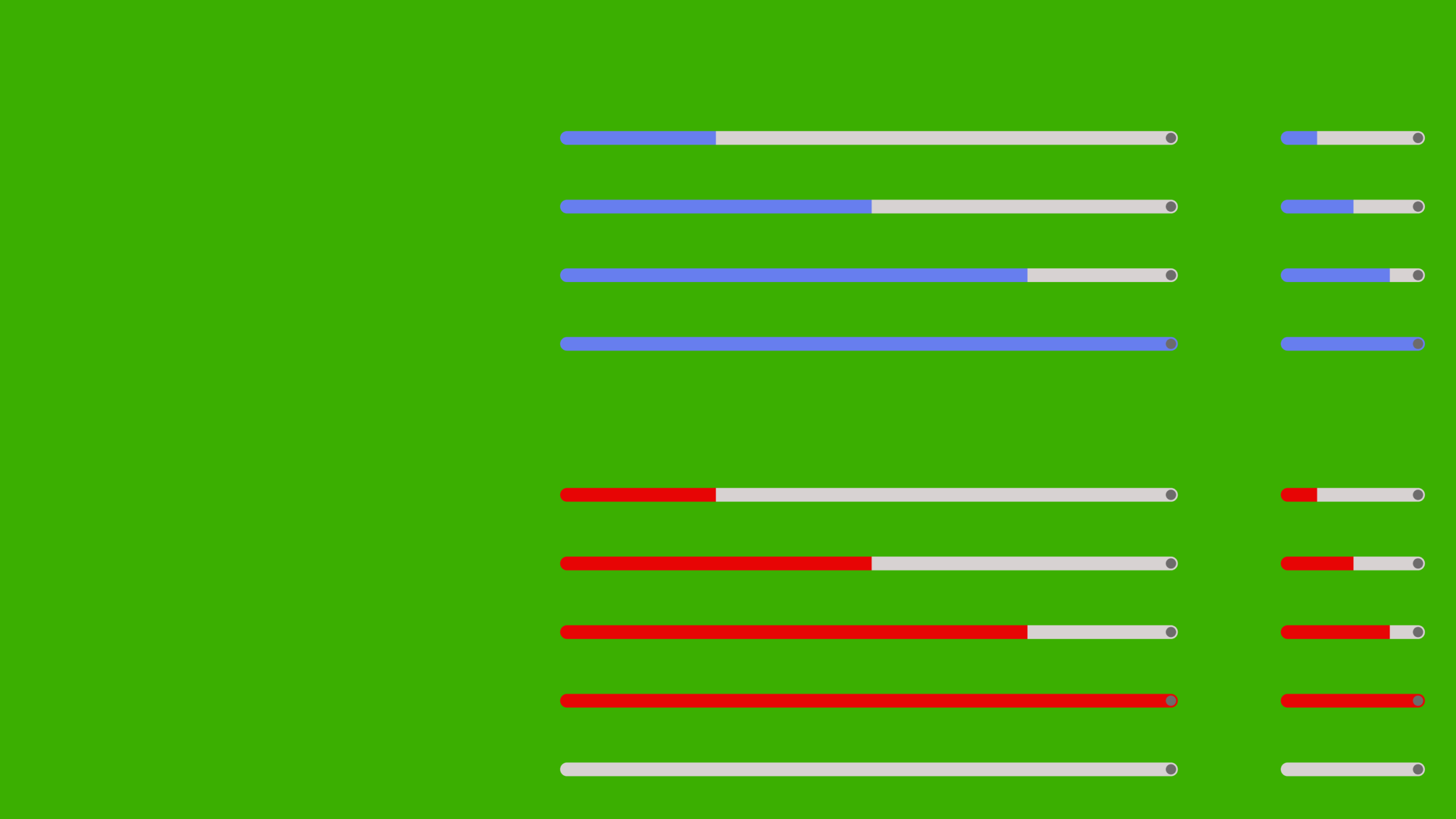
By examining the progress bar, stepper, and status bar together, I identified an opportunity to unify their shared patterns into one flexible, configurable component. This approach would provide greater consistency while giving teams the flexibility to adapt the component to different contexts.
Progress bar
Stepper bar
Status bar
Key Tradeoffs Flexibility vs. consistency
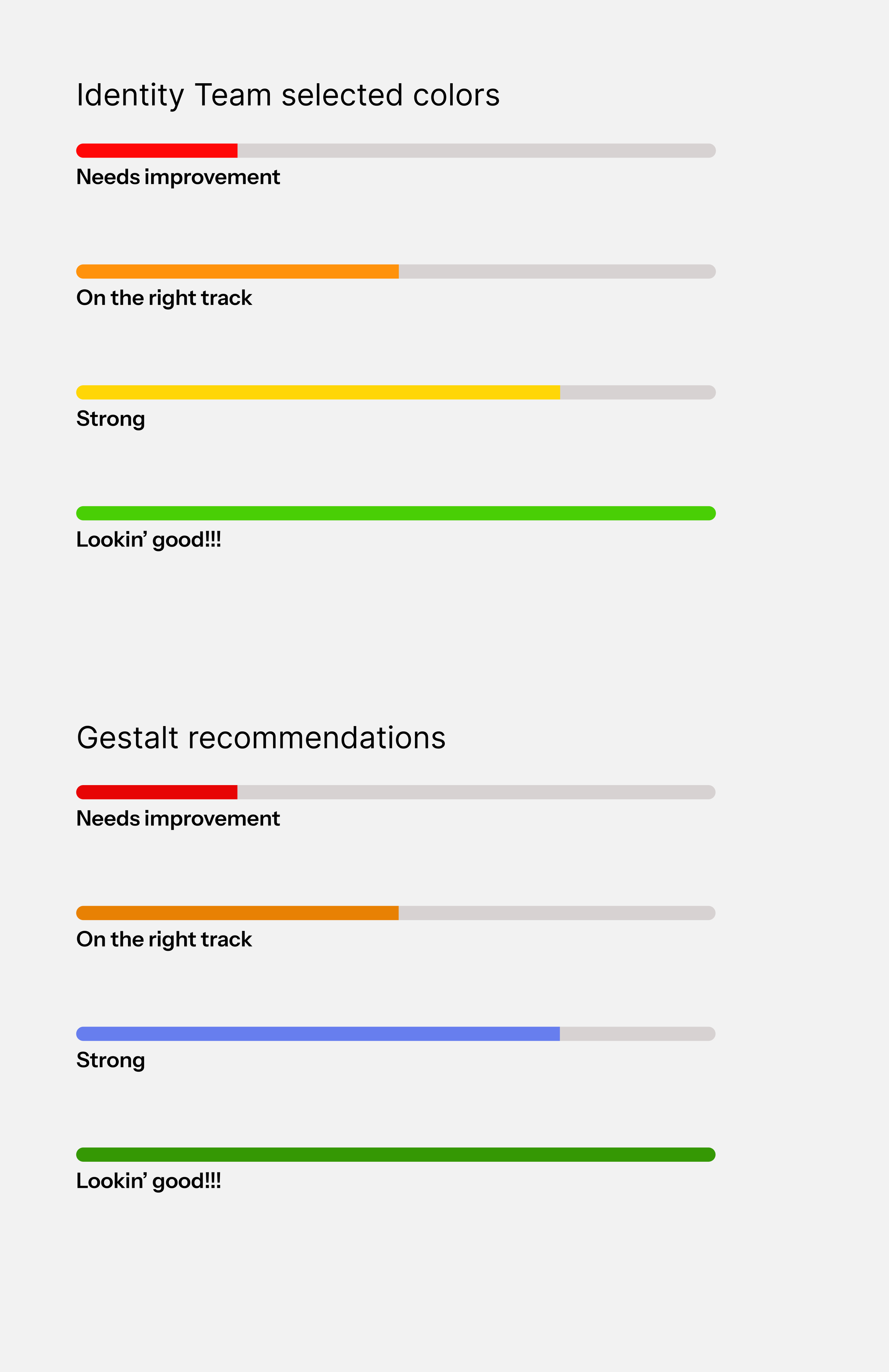
The Identity team requested specific error, warning, and success colors outside Gestalt tokens.
Risk: Introducing non-system colors would fragment the visual language. In addition, the yellow against the gray bar did not pass WCAG contrast ratio at 1.06:1.
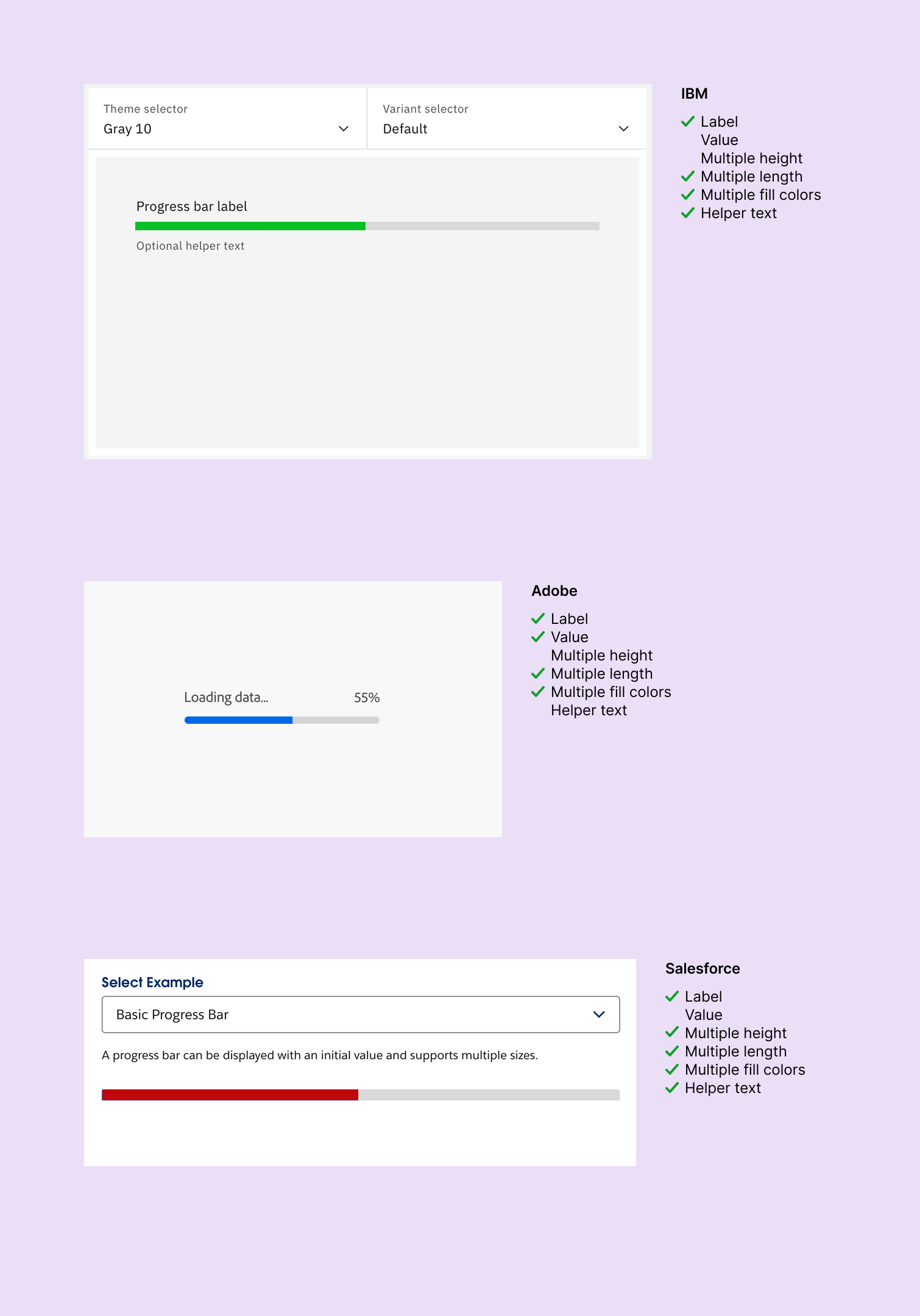
My approach
I leveraged AI to conduct a competitive audit to show that colors can vary widely
Invited cross-team members to discuss color options during office hours
Outcome: I successfully persuaded teams to adopt system colors while still meeting their UX goals. This preserved Gestalt integrity without blocking product needs.
Engineering Collaboration
To support multiple teams, I worked closely with engineers across different product areas to align on requirements and feasibility. I helped coordinate kickoffs, handoffs, and ongoing communication through Slack and Jira, ensuring the component could flex across teams without creating separate versions.
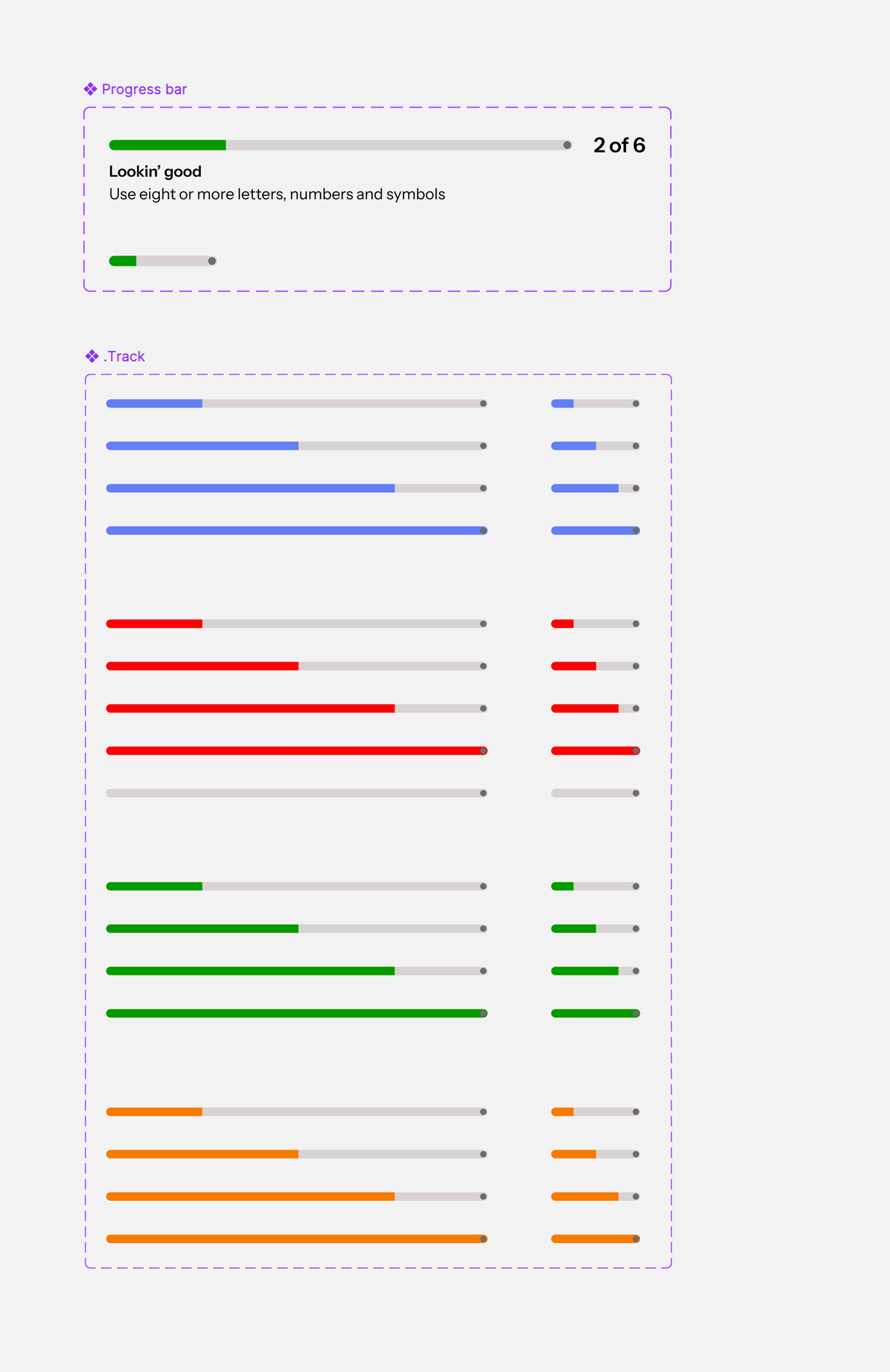
Progress bar: final design and configuration
The result was one flexible, scalable component with multiple variations that could serve all three teams while bringing consistency to the experience across products.
Increasing adoption through the EHQ
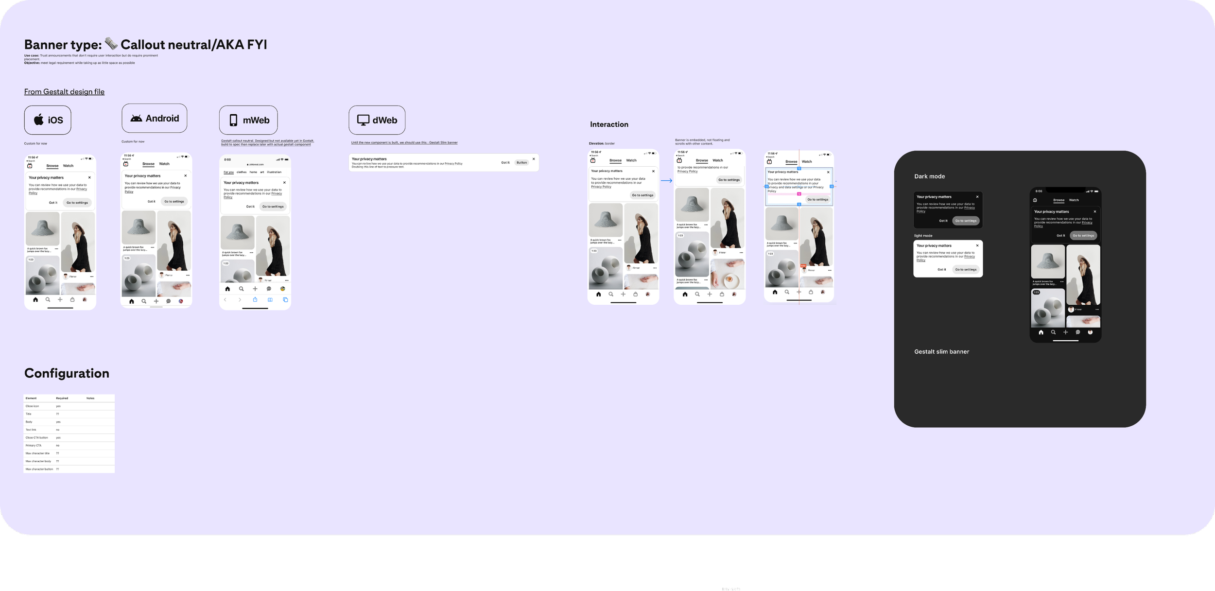
Pinterest’s EHQ was a self-service tool used by product marketing and research teams to deploy components without designer or engineer support. While many of the components appeared to be part of Gestalt, several had visual variations and inconsistencies with the design system.
There were roughly 7 components and 600 instances in the tool. I partnered with engineers to provide designs and specifications for rebuilding the components to align with Gestalt. After outdated instances were removed, the remaining components were 100% aligned with the design system.
EHQ callout banner design for EHQ engineers
Token Studio:
Working beyond the canvas
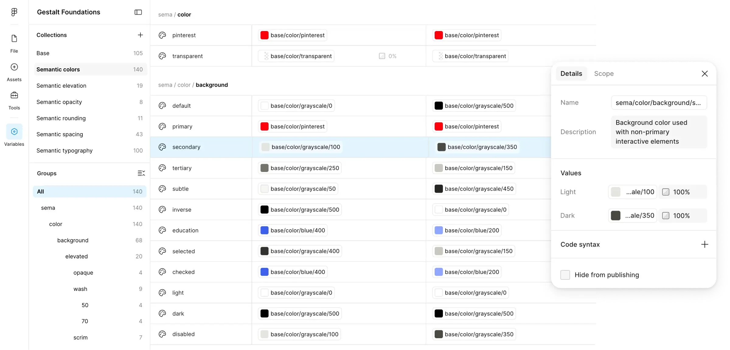
As Gestalt evolved, I expanded my technical understanding of how design systems connect design and code. Working with engineers and a staff designer, I learned to use Tokens Studio and GitHub to manage shared design tokens, generate Figma variables, and help deploy those tokens across Android, iOS, and web. This gave me a deeper understanding of designing not just individual components, but the underlying system that allows them to scale.
Making Gestalt easier to adopt through documentation
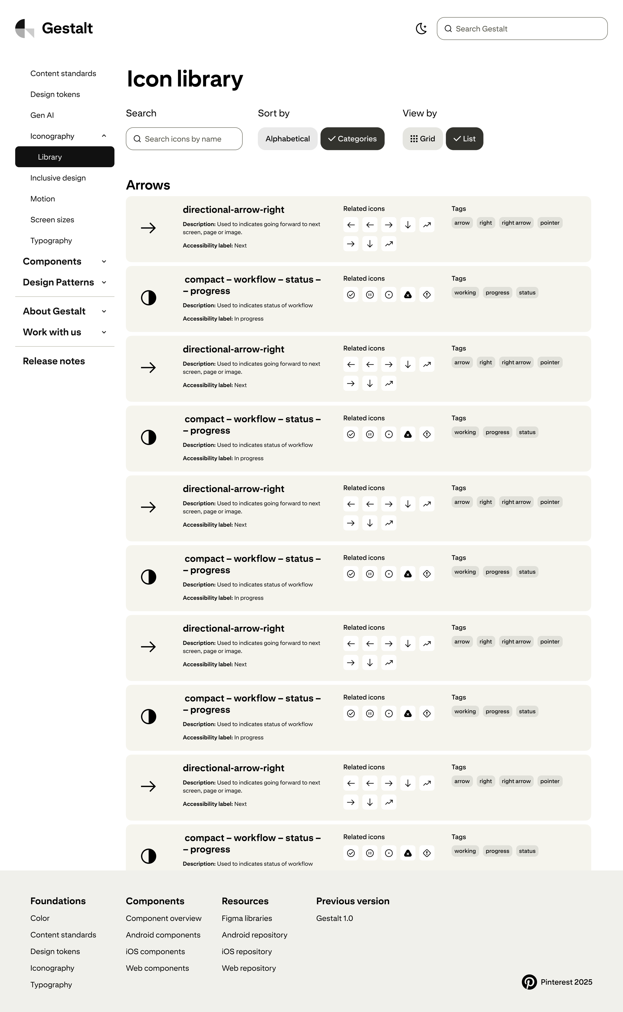
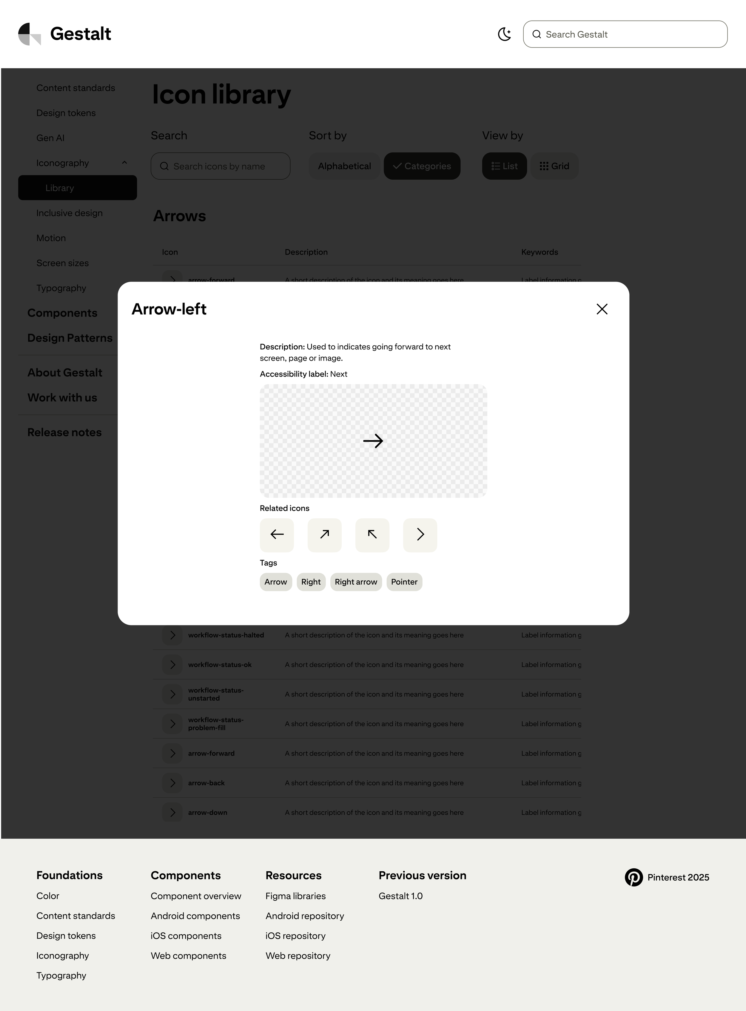
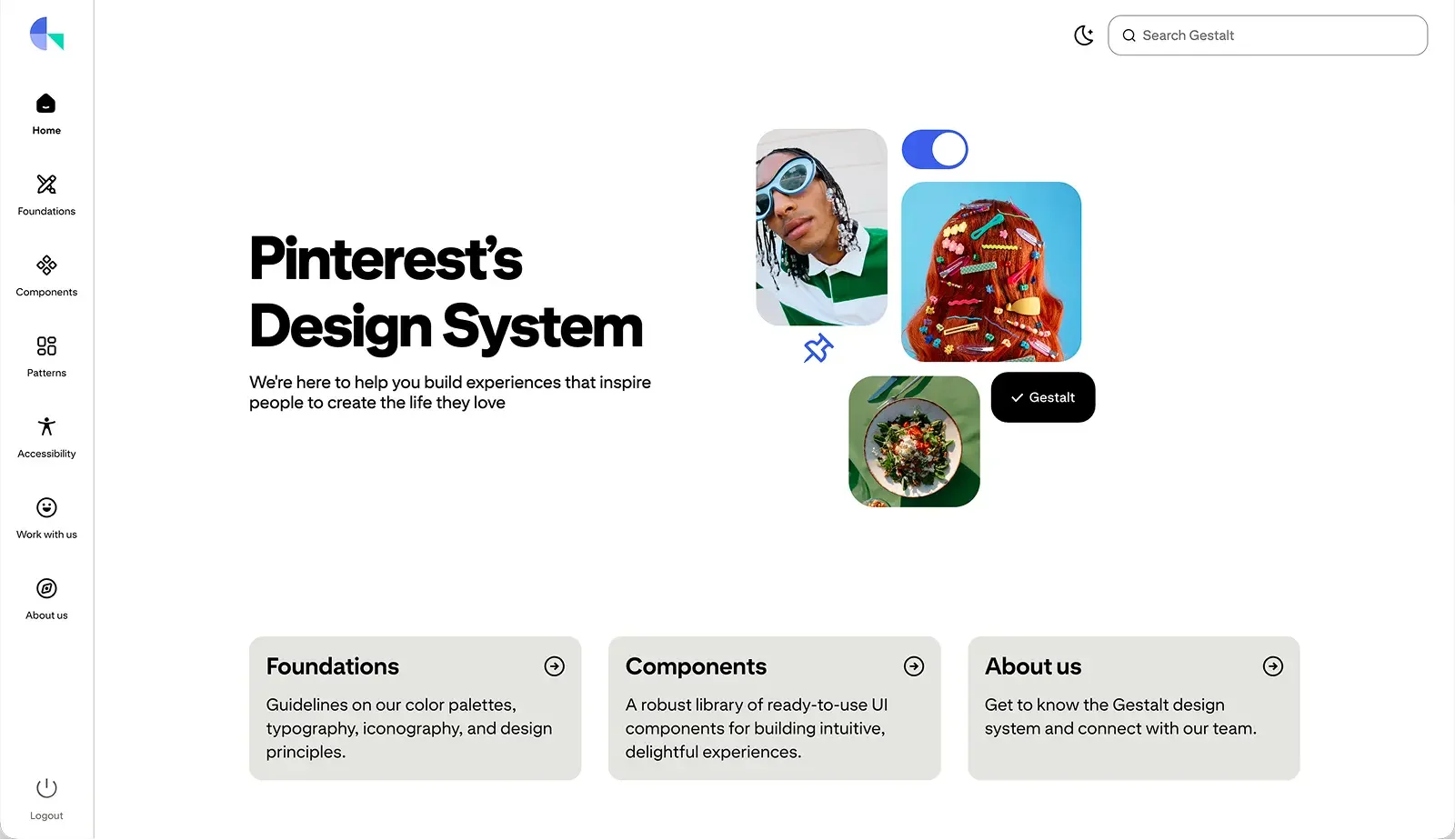
I was involved from the beginning of the redesign of Gestalt’s internal documentation site, partnering with the designer leading the project. I created wireframes for several pages and helped shape how designers would discover and navigate Gestalt components, patterns, and guidance.
The redesigned documentation gave product designers a more accessible central resource for understanding and using Gestalt, helping make the system easier to adopt across teams.
Early wireframes
Evolving Gestalt
Across these efforts, I contributed to Gestalt at multiple levels—from modernizing its visual foundation and expanding its component library to connecting design and code, improving documentation, and bringing existing components into alignment.
The work gave me a deeper understanding of how a design system evolves beyond individual components: through the tools, documentation, processes, and partnerships that make it easier for teams to adopt and scale.