

U.S. Bank partnered with SapientRazorfish to create a new, convenient, and insight-driven app experience designed to make U.S. Bank more central to people’s lives.
The mobile app program brought together six journey teams made up of leading SapientRazorfish and U.S. Bank talent. Together, we achieved the ambitious goal of completely redesigning and rebuilding the app in under a year.
US Bank
Overview
Even the best of mobile banking apps fail to help when needed, creating anxiety and frustration.
The Challenge
Build a human-centered experience that anticipates customer's needs, providing contextual help at just the right moments.
The Solution
My Role: Lead Information Architect / Experience Designer
For just under one year, I led a team of 5 UX designers 2 visual designers through 27 two-week sprints. In the end, we produced a number of help features, including: Contact Us, Help Center, Guided Help, In-Page Help, Notification Management, and Recommended Notifications. Below are some highlights...
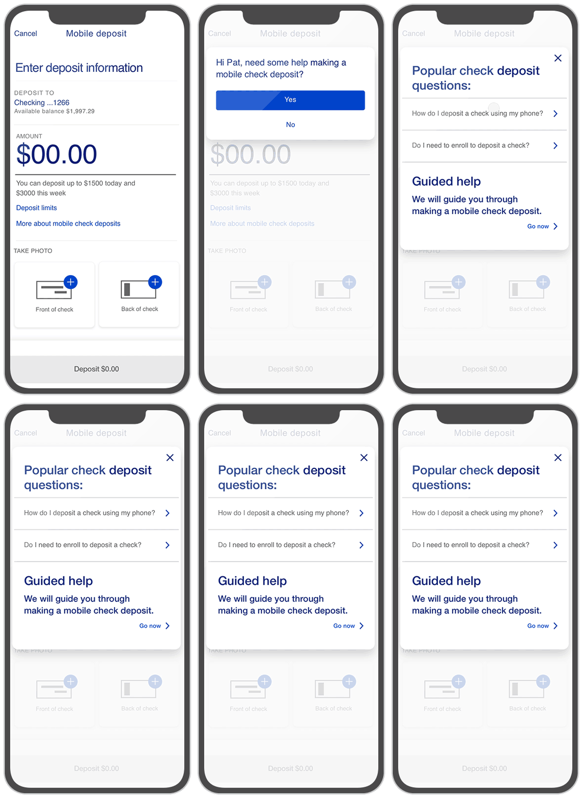
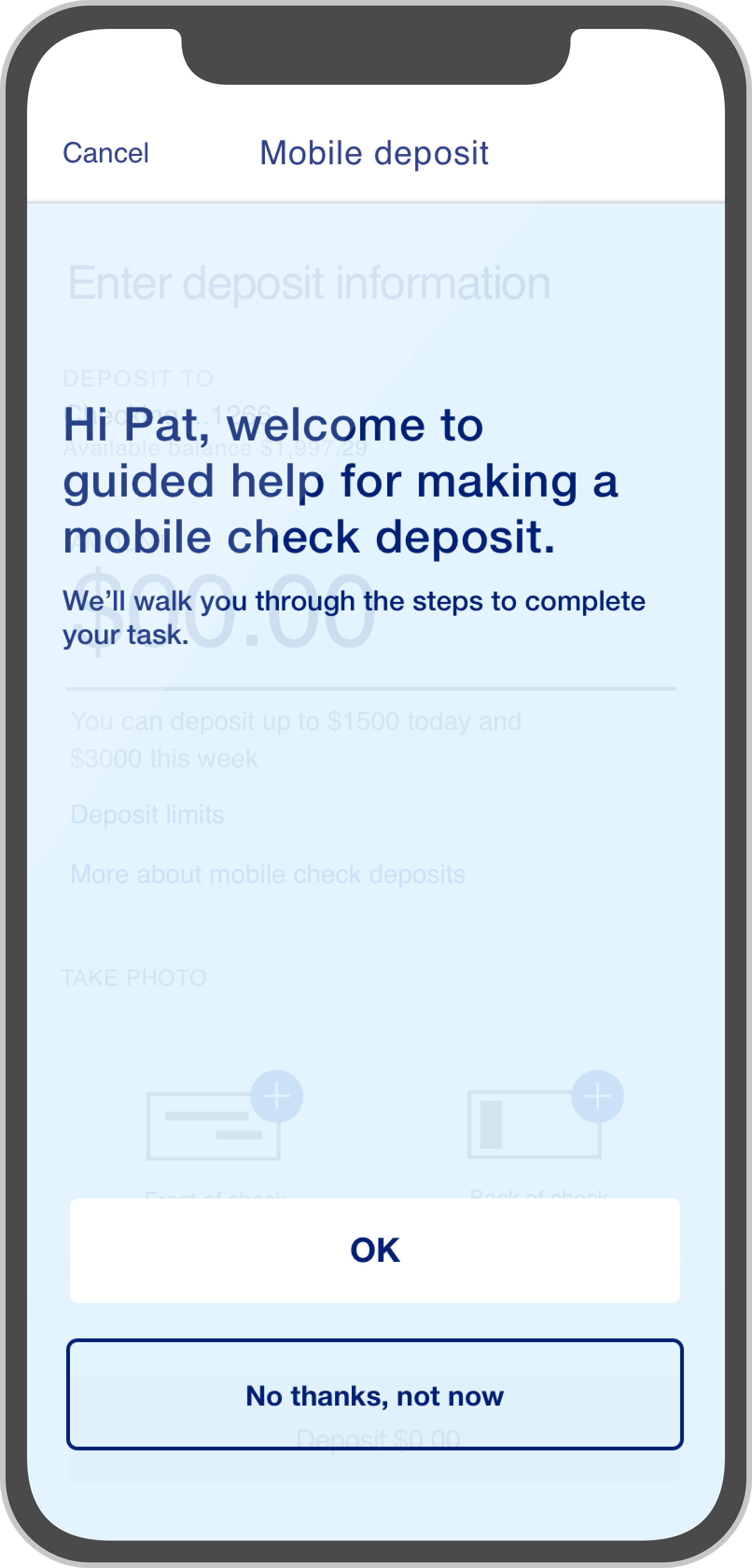
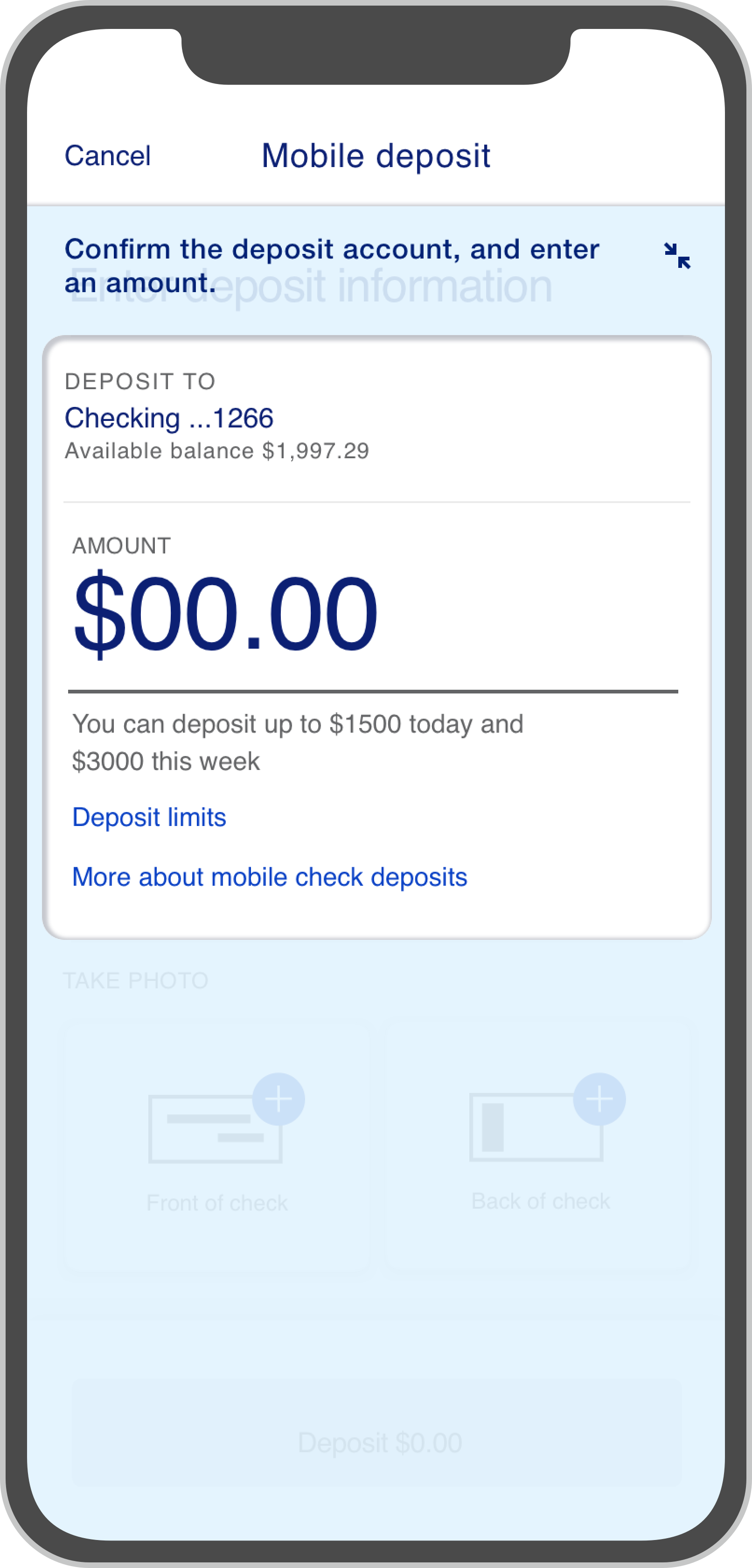
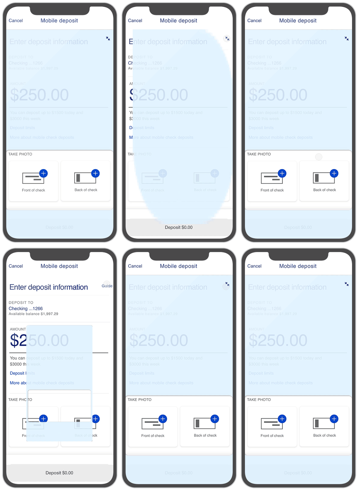
Despite a well-designed new experience, there will always be users whose anxiety prevents them from online banking. Guided Help is one of several help features that provides instant, contextual guidance for those in need. It serves as an overlay that walks customers through complex tasks. Imagine "coach marks" meets "tutorials", only in this case customers are making a real transaction.
Guided Help
U.S. Bank had a dizzying 120+ notifications in need of some design love. After spending time in the current state, I broke down the redesign process into 5 non-linear steps:
Notification Management
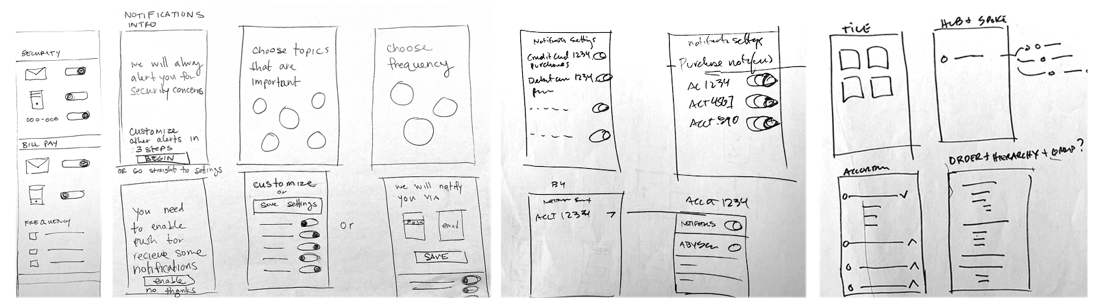
Step 1, Group exercise: Every sprint began with a quick sketch exercise. Business analysts, engineers, content strategists, QA engineers, UX researchers, and designers were encouraged to participate and design with zero constraints. We would then take a vote, but ultimately designers were responsible for making final decisions. It was an awesome team-building exercise and, for many, their favorite part of the sprint.
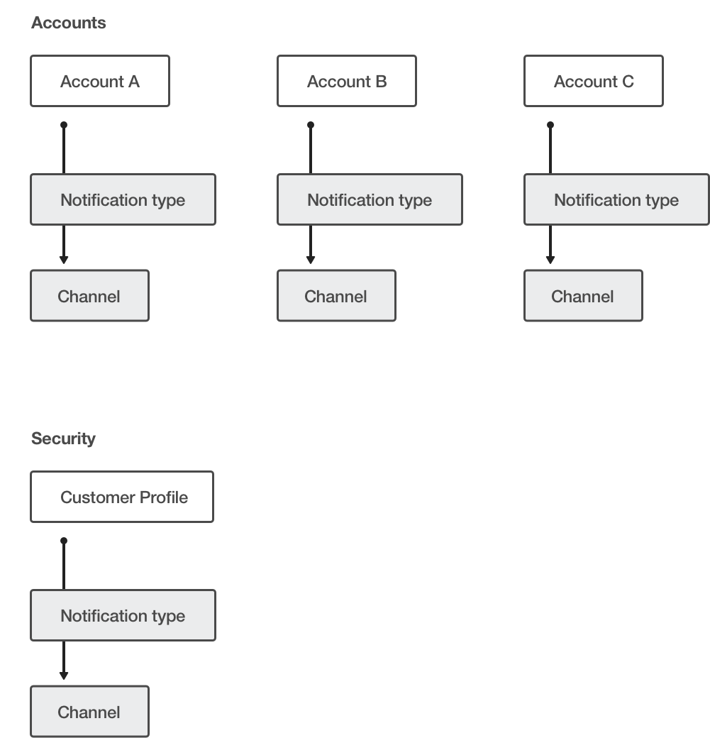
Step 2, Information architecture: I then started to think through different ways to architect the experience. How would one go from settings to a single notification? How do customers feel about different methods of receiving notifications and their frequency? These were questions we would soon have answers to in a customer workshop.
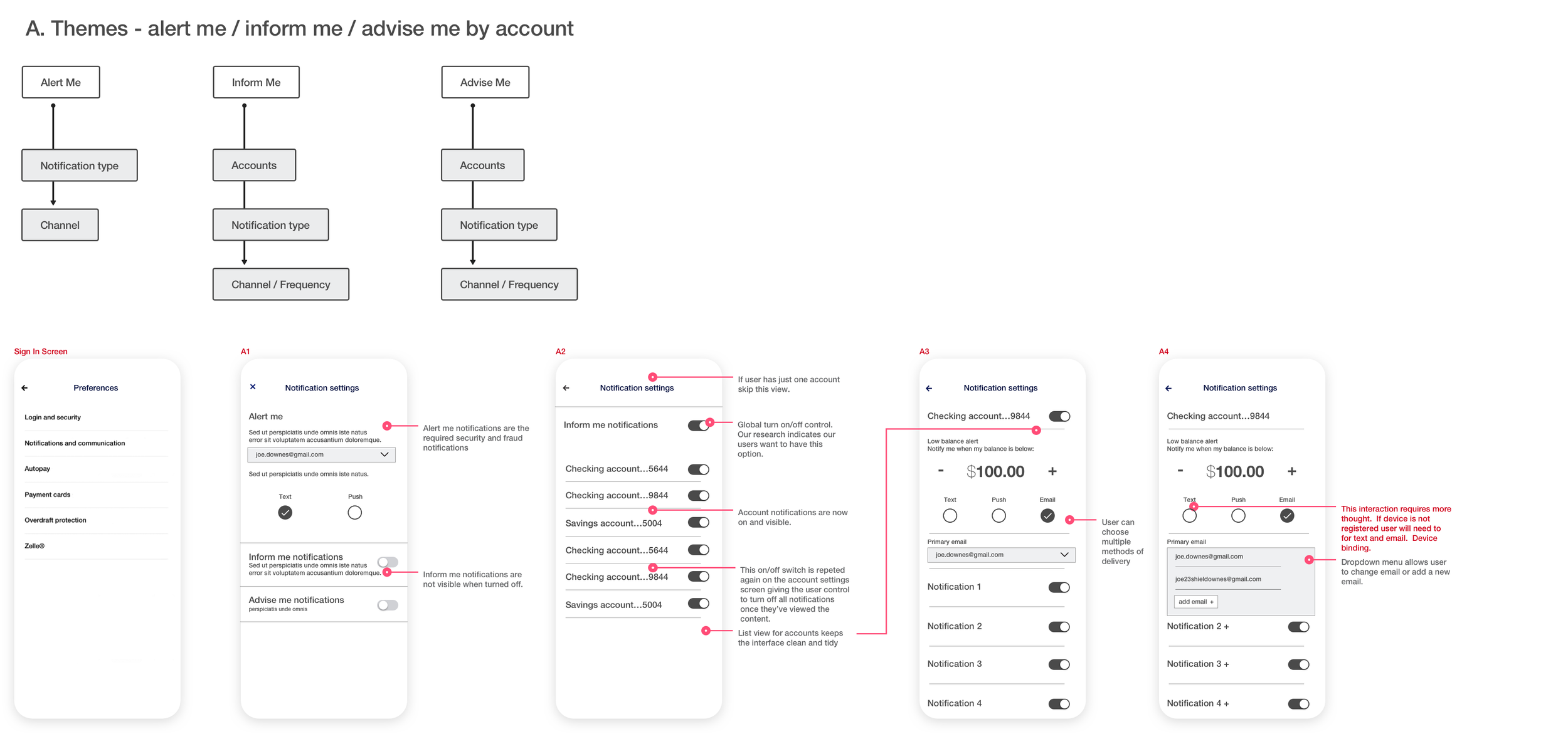
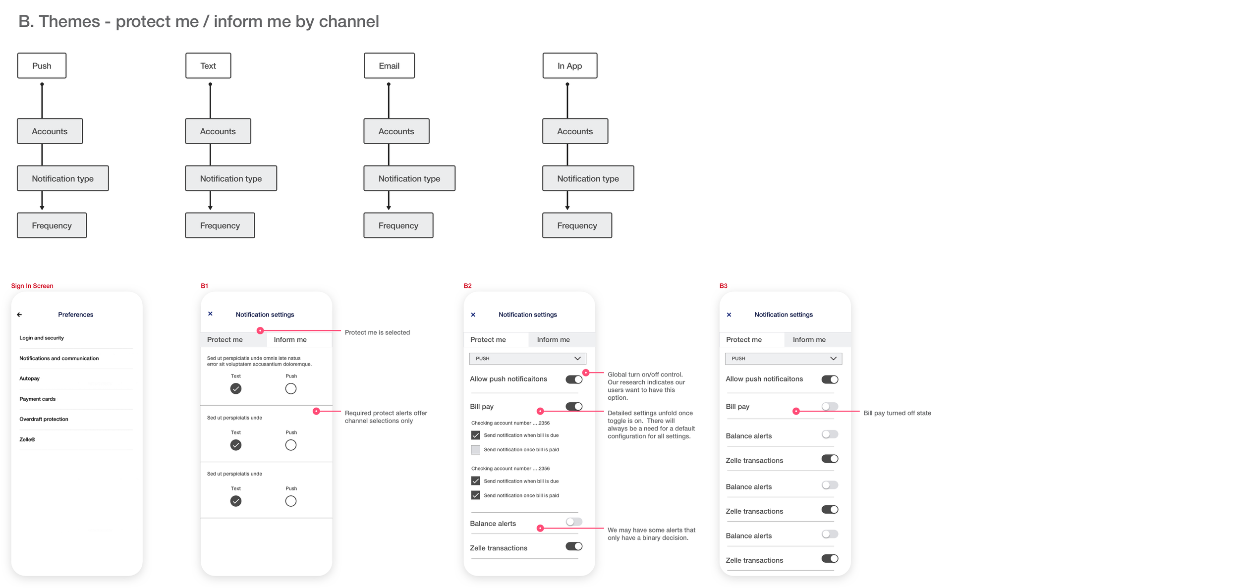
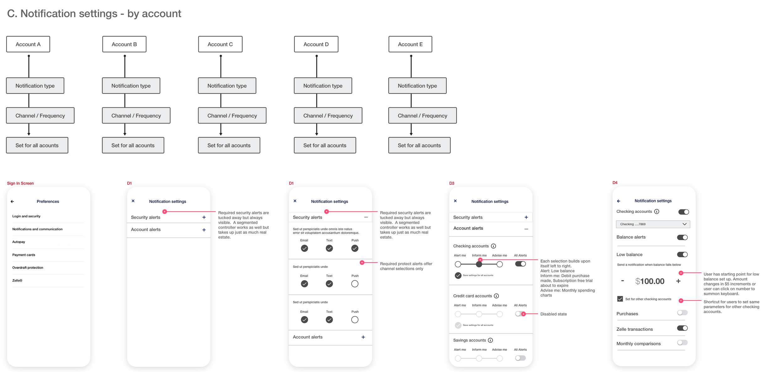
After hearing from real bank customers and several iterations, we landed on a version similar to C, shown above. Users would select a specific account and then drill down to the notification they wanted to change. The other two explorations relied on themes that felt too ambiguous and subjective for research participants to interpret consistently.
Step 3: Simplify the complexity of individual notifications: The second step was to meet with the journey owner, journey analyst, and API capabilities team to determine what we could modify to simplify and improve the experience. The old app required 7-11 steps to set up a single notification. The new designs allowed customers to set up a single notification in 4-7 steps, saving them a minimum of 3 steps.
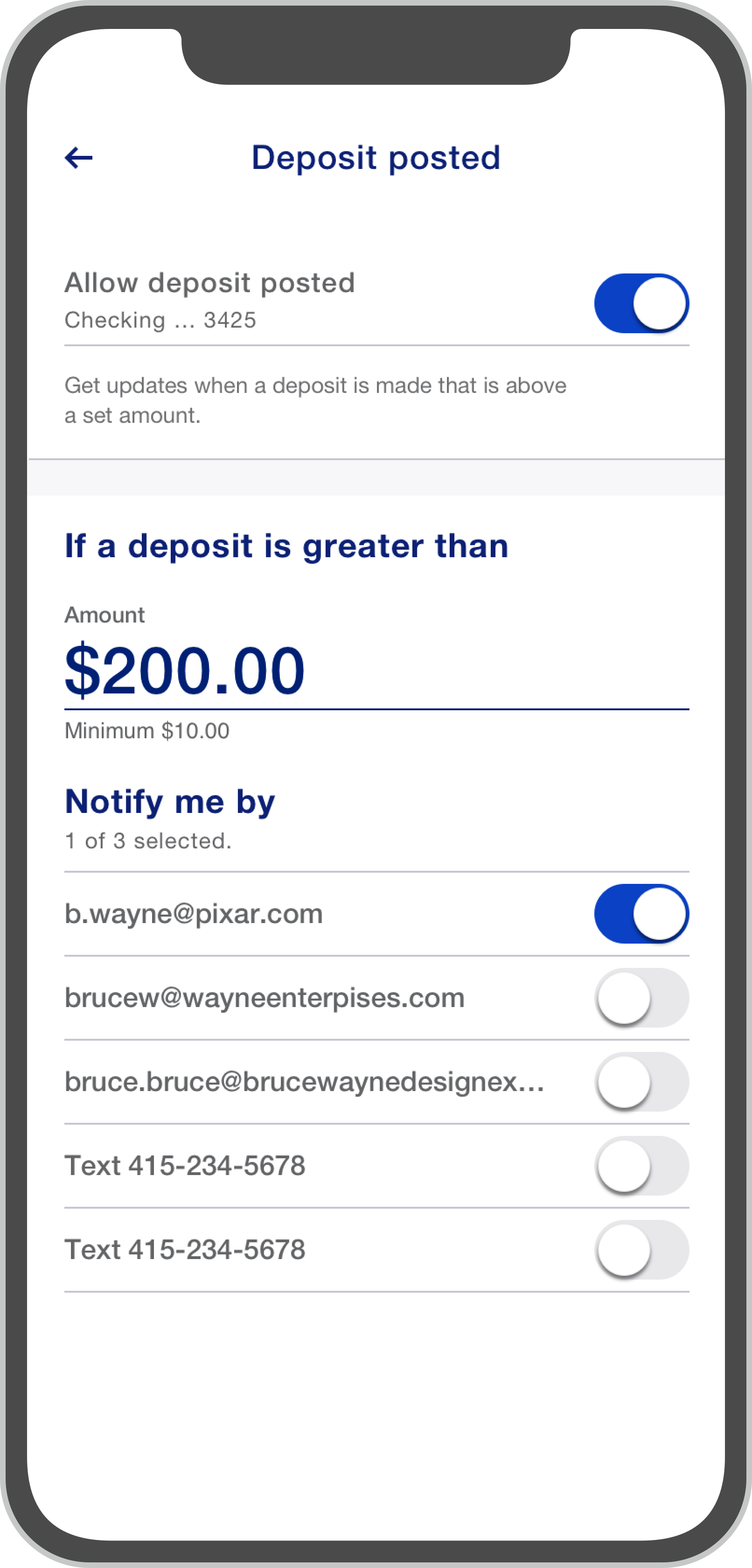
Final flow for deposit-posted notification
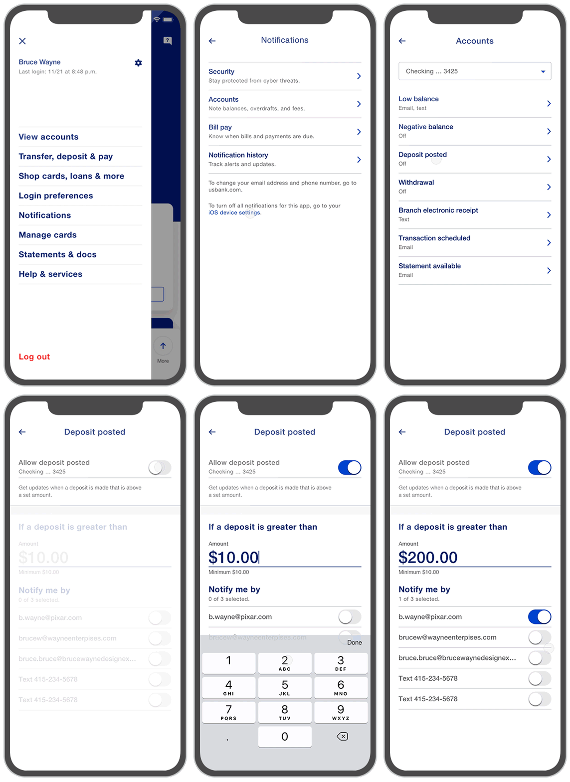
Key decisions were made to minimize the steps to set up a notification:
1. We added all available accounts as a dropdown menu and defaulted to the customer's most frequently used account.
2. We defaulted to the minimum dollar amount for some notifications, potentially saving the user a step.
3. The old experience required users to add contact methods with each notification. The new experience displayed all email and text contact methods, with the primary email preselected, potentially saving the user two or more steps.
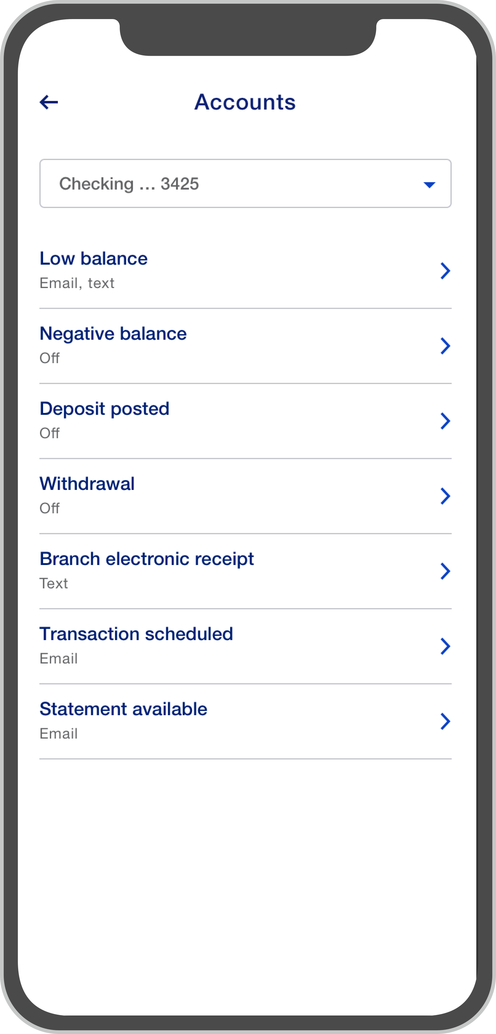
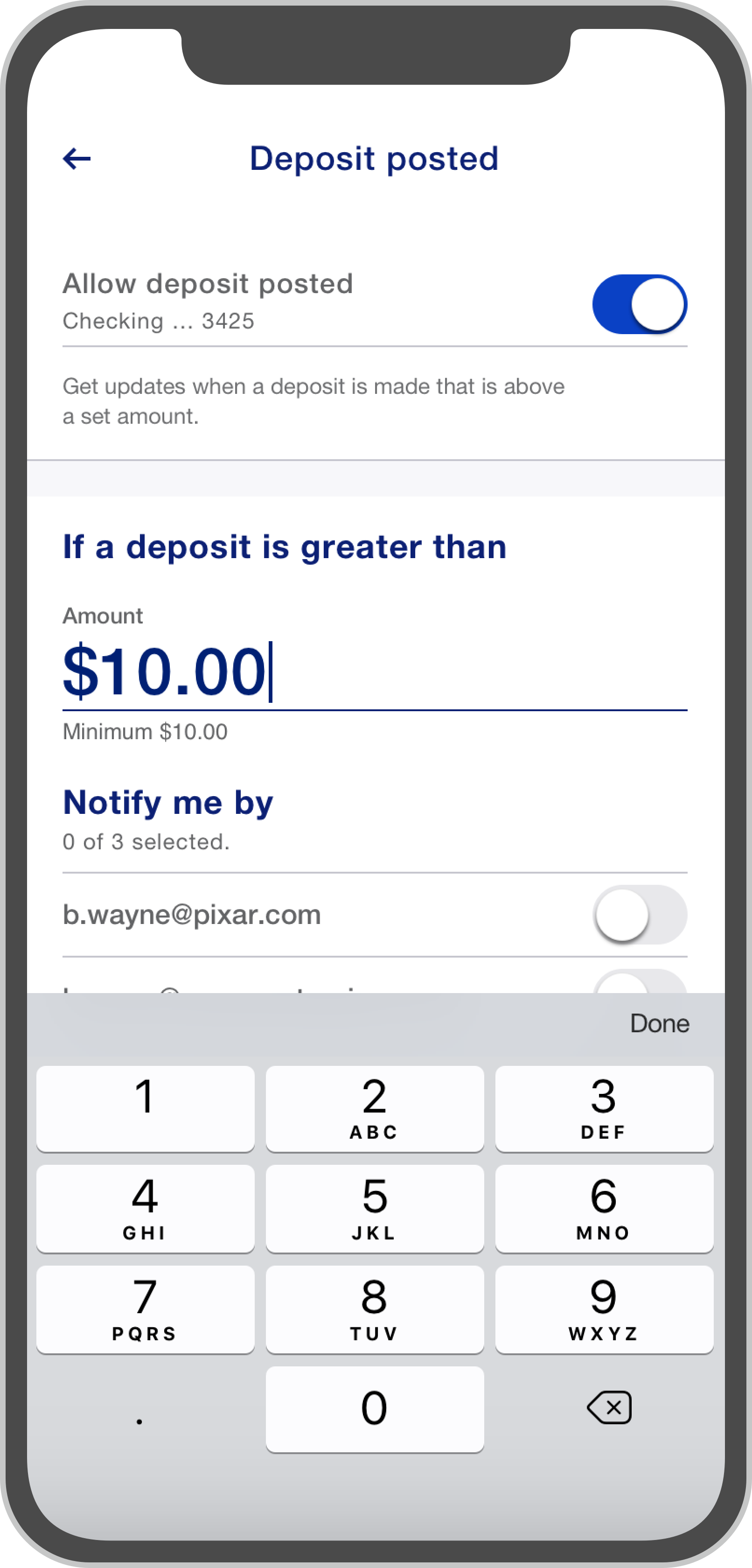
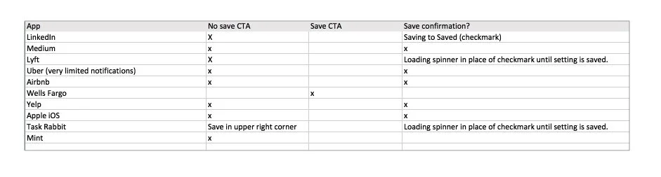
The last key decision was to remove the "save" button and have the app autosave changes. As a tool of persuasion, I conducted a quick competitive analysis of some popular apps to show that most do not have a "save" button in their notification management experience. When we tested the new experience, no participants noticed the "save" button had been eliminated, and all assumed their changes were saved even without a confirmation.
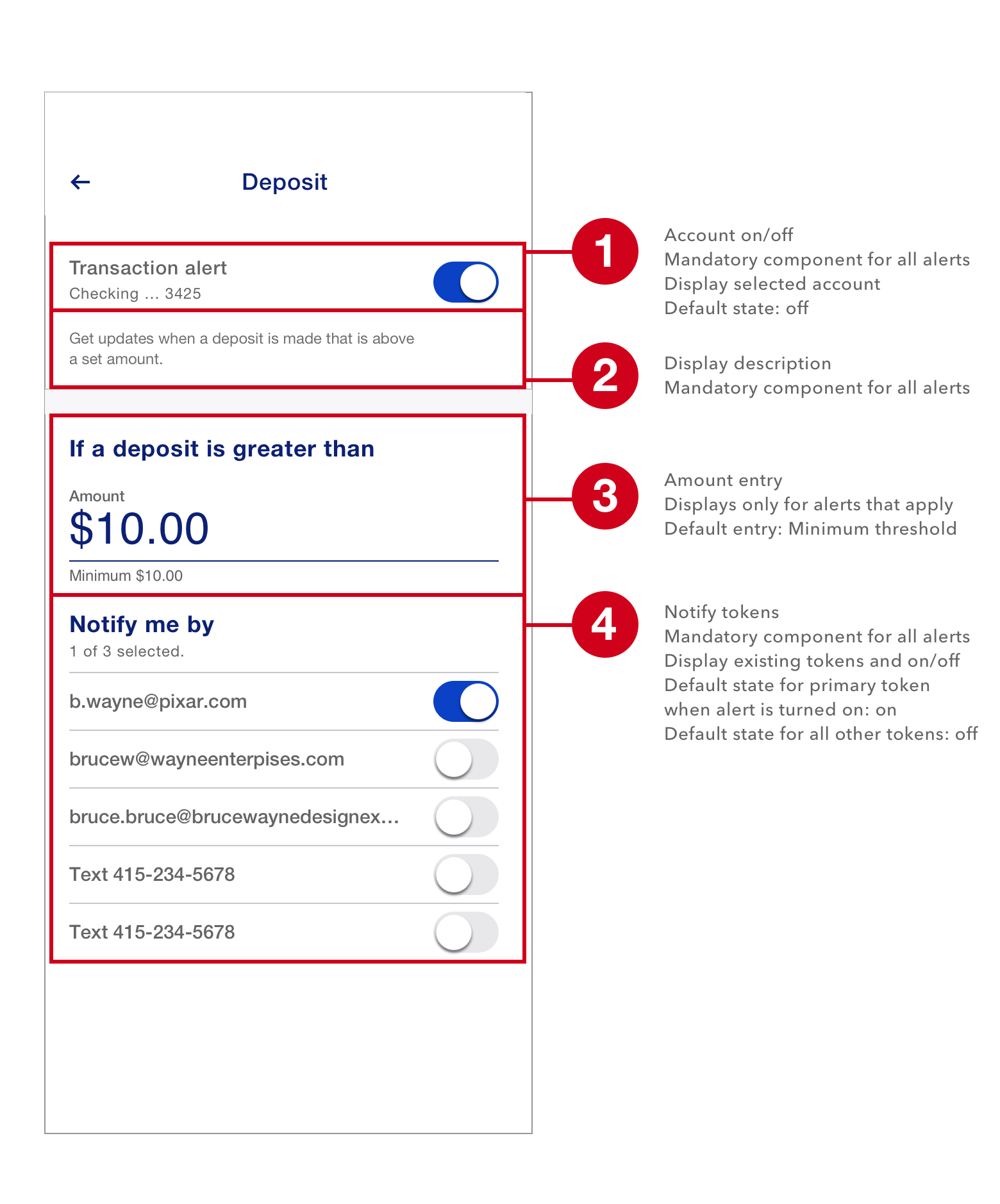
Step 4 component(ize) it: After my analysis, I quickly realized that most notifications contained three components: an on/off switch, a description, and a set of delivery methods. A small subset contained a fourth component: an amount threshold. To streamline design and development, I proposed a component system of 4 modules that developers could pull from. This freed designers from having to create 120+ screens.
Step 5 edge cases: As with every system there are a number of edge cases that needed to be identified and designed against. We also needed to consider legacy cases where aspects of the old design needed to be honored. Though we had improved the withdrawal/deposit notification experience considerably, we still needed to design a set of screens based on very complex business rules. Working closely with our journey analyst, I insured the experience was seamless.
When business requirements and user satisfaction collide.
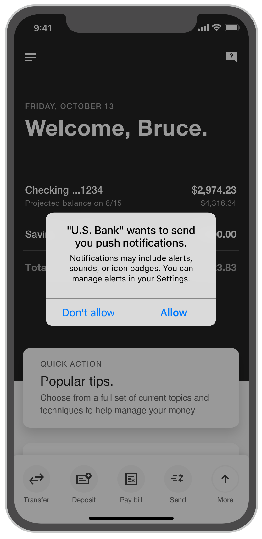
For the first time in U.S. Bank's history, push notifications were to be introduced. The business unit in charge required that users who opted to receive push notifications at the iOS level automatically be enrolled into "purchase notifications" (triggering a new notification with every purchase). This notification was successful with other institutions, but in our research, we found that while some users loved the idea, others were annoyed. We feared that these frustrated users would turn off all push notifications in their iOS settings. We took preemptive measures to mitigate potential user frustration while still satisfying the business ask by providing push management tools immediately after the user opted into push.
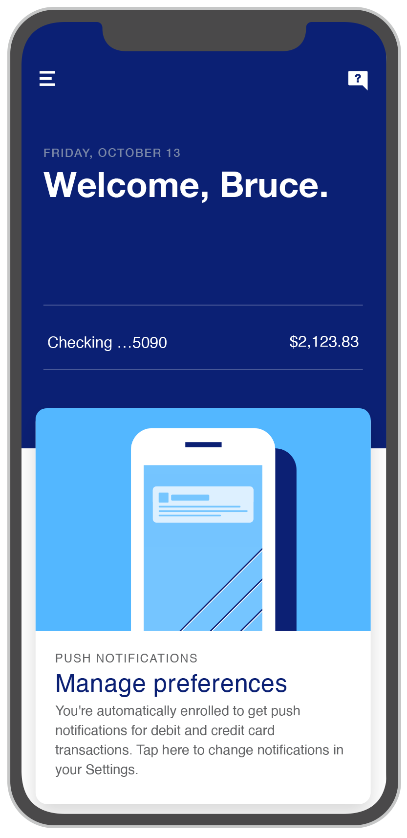
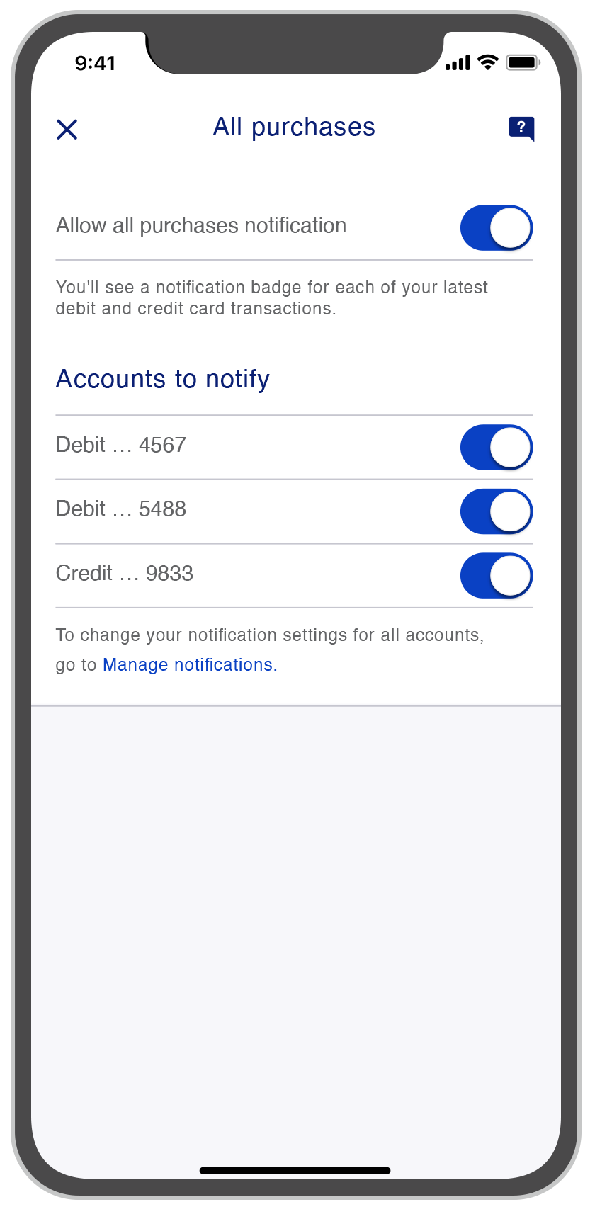
Notification Recommendations
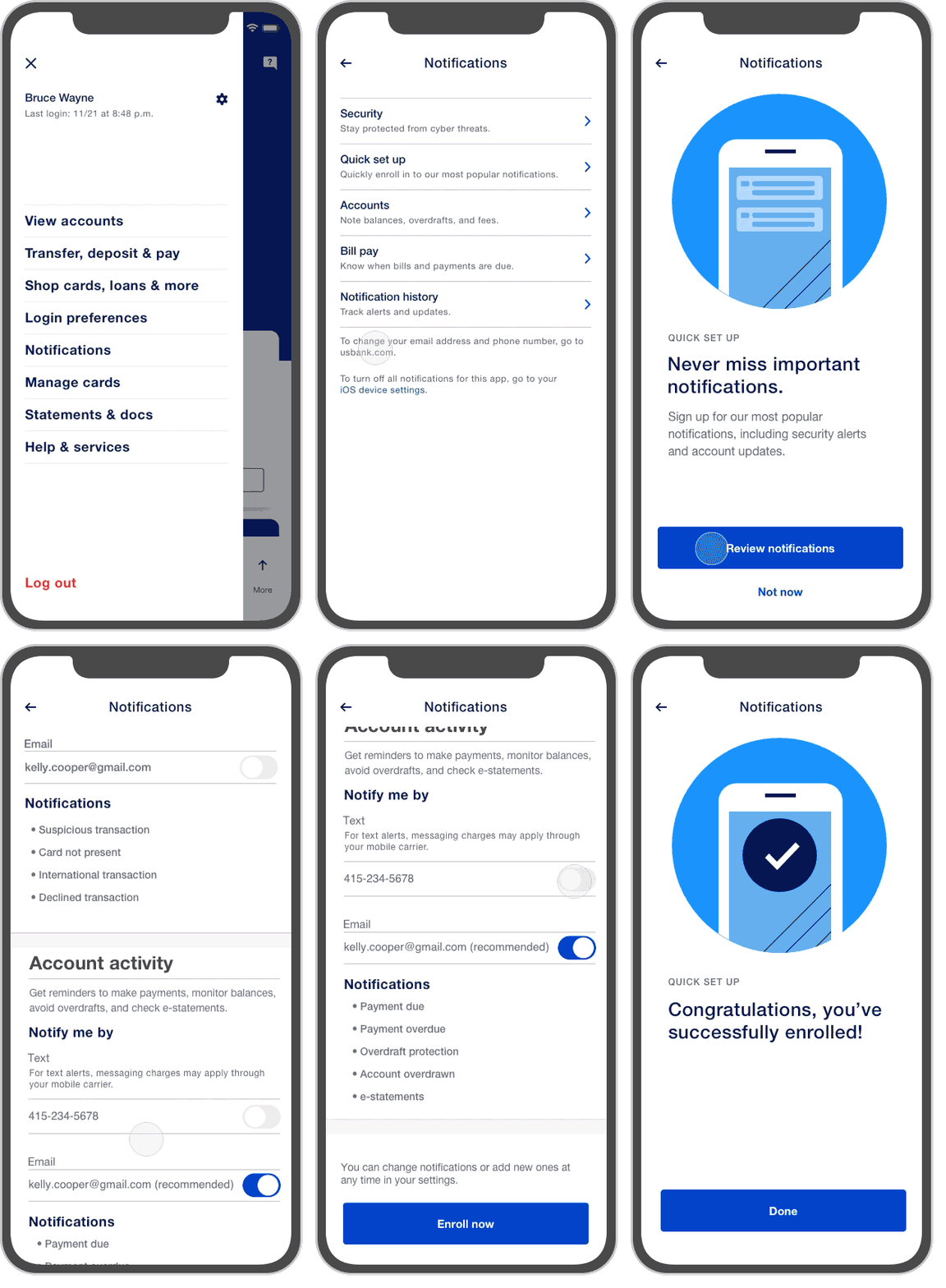
Through the same research mentioned above, we discovered customers wanted to receive notifications but didn’t want to go through the arduous task of searching all 120 to find the ones that are relevant. To solve this, I designed an experience that offers the most popular notifications while taking less than a minute to set up.
Quick set up flow
A Net New Design System
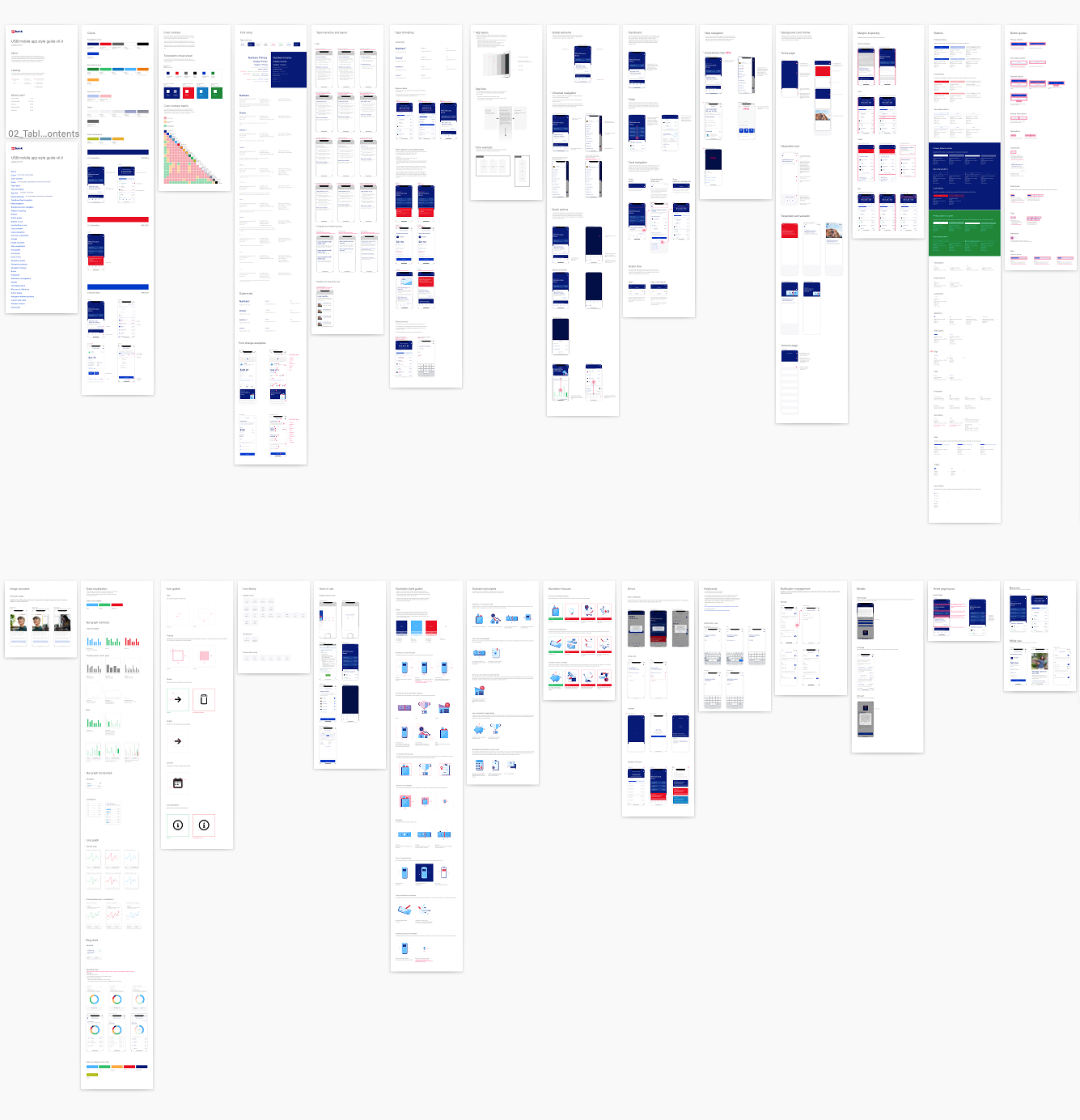
From the start of the project, each team would frequently create new styles, elements, components and interactions that would feed into a net new design system. As a result, our team made numerous key decisions that influenced the look and functionality of the app.


Impact
4.8 out of 5 stars!
Since the launch of the new app:
Engagement increased while contact center and branch traffic declined, supporting the broader transformation strategy.
AI-driven insights now reach 95% of customers, with 86% rating them “very helpful.”
The work helped support a customer-first digital strategy recognized by American Banker.